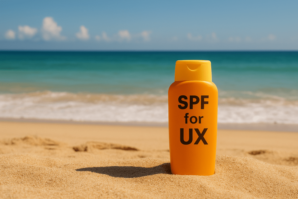
SPF Isn’t Just for Your Skin
Welcome back my sun-soaked Caffeinated Creatives!
It’s summmmmmerrrrr! The season of iced coffee, 87 open Figma tabs, and pretending you’re not sweating through your favorite band tee during that client call. It’s June, and while the sun’s out and buns are toasting, your project pipeline is probably sizzling too. Feature requests are rolling in faster than beach balls in a windstorm, and somehow you’ve become the only thing standing between your team and a full-on project sunburn.
You wouldn’t hit the beach without slathering on sunscreen, right? (Right? Please say right.) So why are we diving into complex UX problems without a protective layer of mental clarity? Why are we skipping steps, skipping lunch, and skipping the vital act of thinking before doing?
A recent Gallup study revealed that nearly 76% of U.S. employees in creative industries experience burnout at some point in their careers . That’s a scorching statistic that underscores the importance of proactive self-care and structured workflows. (uxplaybook.org)
Enter: The SPF Rule of UX: Stop. Prioritize. Focus.
This isn’t skincare advice (Although, real talk, you should wear SPF), but this is about preventing another kind of burn… the cognitive, chaotic kind that leaves you spiraling halfway through designing a search bar for a feature no one asked for.
This blog isn’t sponsored by Banana Boat… but honestly, if they’re reading, let’s talk 🤪
S = Stop
Let’s get this out of the way: stopping is not laziness. It’s strategy. It’s the UX equivalent of taking off your sunglasses to see if that’s your client waving at you, or just a really aggressive seagull. When everything feels urgent, stopping is rebellious in the best way.
Too often, we react. Someone google chat’s you “Can you whip up a quick mockup?” and our designer lizard brain screams “YES, I AM USEFUL.” Before you know it, you’re 23 artboards deep in a design no one actually needs. You skipped context. You skipped questions. You skipped lunch (again). All because you didn’t stop.
Taking a beat isn’t just about slowing down. It’s about intentionally pressing pause before committing your energy, your time, or your really cute button components. Ask yourself:
What’s the real goal?
Before you even touch Figma, grab your metaphorical SPF and ask: what are we actually trying to achieve here? Not “what did someone ask for,” what problem are we solving? Is this a surface-level request masking a deeper issue? Is this just someone wanting a shiny new button because they saw it in a competitor’s app and got UI envy?
Zoom out. The real goal might not be what’s in the chat thread. Maybe they asked for a new homepage banner, but the real issue is that no one understands the value prop. You’re not just a button-pusher… you’re a problem detective. And real detectives don’t skip the briefing and go straight to designing the sting operation.
Who is this for?
Seriously. Who. Is. This. For? If the answer is “uhh… the users?”… that’s a red flag on a good beach day. Be specific. Is it for new users onboarding for the first time? Power users navigating via keyboard shortcuts while juggling three tasks? The CEO’s cousin who “wants to try the app and give feedback”?
If you don’t know who you’re designing for, your solution will be like those one-size-fits-all beach hats: technically wearable, wildly unflattering, and completely ineffective in strong wind.
Designing without a clear audience is how you end up with features that confuse everyone and delight no one. Know your audience like you know your favorite cold brew order. Extra strong, no fluff.
Does this exist already and someone just forgot?
Look, we’ve all been there. A request lands, and it feels fresh, important, and urgent, only to discover it’s the UX equivalent of inventing the wheel for the third time this quarter. Maybe it lives in a dusty figjam file. Maybe it’s hiding in a word doc with 87 comments and a passive-aggressive emoji thread. Or maybe, just maybe, it’s buried deep in the internal client folders… that no one has updated since your intern left in 2022.
Before diving in, do a quick recon. Ask around. Search your folders. Ask the one coworker who always remembers everything (and reward them with a coffee later). Not every solution needs to be new… sometimes it just needs to be rediscovered, refreshed, and rolled back into the spotlight like a forgotten beach umbrella on a hot day.
You wouldn’t rub tanning oil on before checking if you packed SPF 50. Or… maybe you would. No judgment. But don’t design like that. Build in moments to breathe. Make a ritual of it. Light a metaphorical candle. Whisper “What are we even doing here?” into the void.
Stopping is a UX power move. It’s the deep breath before the wireframe. The prelude to productivity. Top off your 3rd Iced coffee of the day and chill for a minute.
P = Prioritize
Summer is the season of overcommitment. From impromptu barbecues to overambitious road trips, everything feels like a “yes.” UX is no different. Feature requests start popping up like weeds. Everyone suddenly has “just a small thing” that turns into a weeklong sprint. Sound familiar?
Here’s the thing: not every idea deserves your swimsuit budget. Or your time.
Prioritization is how you separate hot dog stand ideas from full-blown waterpark upgrades. It’s how you keep your roadmap from turning into a bloated carnival of maybes. And it starts by asking the hard questions:
Who’s actually impacted by this feature?
Not who wants it. Not who shouted the loudest in the zoom call. Who’s actually impacted if this ships? This is where prioritization separates the “nice-to-haves” from the “this-will-actually-make-someone’s-day” essentials. If a feature only serves one internal stakeholder but disrupts the experience for 80% of your user base, it might need to wait. Or gently be tossed into the “future ideas” folder. You know, that magical place where ideas go to hibernate indefinitely.
Ask: Will this help new users onboard faster? Will it streamline workflows for your power users? Or are we just adding glitter to the login screen because someone on the leadership team watched a SaaS video trending on tiktok at 2am last night?
When everything feels like a priority, clarity comes from focusing on who you’re really building for… and whether they’ll even notice (or care) if this thing goes live.
What business goal are we advancing?
Good UX isn’t just about pixel-perfect buttons and smooth animations, it’s about moving the needle. So ask yourself: how does this feature tie back to the larger business goals? Are we driving more conversions? Reducing churn? Helping support spend less time answering “Where’s the cancel button?” tickets?
If a request doesn’t ladder up to a core business goal, it might be a vanity project wearing a cape. Looks cool. Doesn’t save lives. Don’t get distracted by shiny objects or executive whims disguised as “customer feedback.”
Try to tie every feature back to something measurable. Something that actually matters.
What happens if we don’t do this until next quarter… or never?
This is the ultimate pressure test. If the idea of not doing this thing immediately doesn’t cause a collective team panic, it’s probably not a top priority. Spoiler: not everything needs to ship yesterday, even if someone put fire emojis in the email thread.
Ask: Will this hurt retention? Will it block other features from launching? Or will we all forget about it in a week and quietly move on with our lives?
If the impact of delay is low, that’s a strong signal it can wait… or be shelved entirely. And sometimes, shelving something is an act of mercy. For your team, your users, and your cognitive sanity.
Designing everything at once is like wearing every swimsuit you own to the beach. Technically possible. But confusing for you, alarming for others, and uncomfortable across the board.
Don’t be afraid to play lifeguard. Sometimes you have to blow the whistle and say, “No, Karen, we are not building an animated dolphin mascot for the loading screen this week.”
Use a prioritization/project management software (we use Basecamp), or keep it analog and sticky-note your way to sanity. Just make sure product, design, and dev are all floating in the same inflatable unicorn of alignment. Because when priorities are clear, execution is less about dodging waves and more about riding them.
F = Focus
You’ve stopped. You’ve prioritized. Now it’s time to focus like a sunbeam through a magnifying glass. Only instead of burning ants, you’re burning through ambiguity, distraction, and Figma tab roulette.
Focus is the final SPF layer, and it’s where a lot of good UX gets fried.
Context switching might seem like a productivity badge of honor. “I’m juggling five tasks!” you say, while nervously sipping coffee and Googling how to make a about us page look “more humanized.” But the truth? It’s like trying to eat a popsicle, answer email, and dodge a flock of seagulls all at once. Something is gonna fall. And it’s probably going to be your sanity.
Focus means respecting your cognitive energy. It’s a finite resource, like your patience for clients who think UX is “just making things look nice.” Protect it. Guard it. Put up your little “Do Not Disturb” flag and claim your space.
When you focus, you do more than check things off a list. You create work that’s thoughtful, aligned, and less likely to come back with 37 comments asking, “What’s the purpose of this again?”
The Aftercare: Iterate, Improve, Reapply
SPF isn’t once-and-done, and neither is good UX.
Let’s not pretend SPF is a one-and-done ritual. You know better. You reapply, you adjust, you realize halfway through the beach day that you missed a spot and now your left shoulder is tomato red. UX is no different.
The SPF Rule isn’t a one-and-done checklist… it’s a whole mindset. A mantra. The kind of phrase you’d slap on a Stanley tumbler and repeat to yourself when your sprint board starts looking like a chaotic Pinterest mood board from 2014.
Come back to it when things feel too chaotic. When the work is piling up and the team is spiraling. When someone says, “Let’s just get something live by Friday,” and your designer soul cries a little.
Share the SPF Rule with your team. Make it your UX happy hour theme… or just post it on the wall and nod at it dramatically during meetings. However you keep it alive, just make sure it’s part of the culture. Because the best UX teams aren’t just reactive. They’re intentional. They know how to stop, how to prioritize, and how to focus, even when the temperature’s rising.
Bonus: SPF Your UX Checklist
Stop:
- ▢ What are we actually trying to solve, not just what someone asked for?
- ▢ Who is this feature really for? Be specific. (“Users” is not specific.)
- ▢ Does a solution already exist and everyone just forgot? (Have you actually checked the wiki?)
- ▢ Have we asked why at least three times yet?
- ▢ Did we write down the actual goal in one sentence without buzzwords?
- ▢ Do we need to build something new, or just improve what’s already there?
- ▢ Are we reacting or responding with intention?
- ▢ Did we include the right people before jumping in?
Prioritize:
- ▢ What’s most important to the user, and what’s just executive sparkle requests?
- ▢ Which requests tie directly to measurable business outcomes?
- ▢ What’s time-sensitive vs. just loud?
- ▢ What’s the actual cost (in time, effort, and sanity) of building this?
- ▢ What happens if we push this to next sprint? Or next quarter? Or never?
- ▢ Who will be thrilled this ships… and who will notice if it doesn’t?
- ▢ Is this blocking other higher-priority work?
- ▢ Have we agreed (with Product + Dev) on what gets dropped to make room for this?
- ▢ Did we avoid saying “yes” just because someone used the word “critical” in bold?
Focus:
- ▢ Are we working on one problem right now, or doing mental gymnastics?
- ▢ Is our Slack status up, notifications down, and focus mode on?
- ▢ Are we timeboxing this task or winging it until the next fire drill?
- ▢ Are we hopping between tabs like a caffeinated squirrel? (Be honest.)
- ▢ Do we know the definition of “done” before starting?
- ▢ Have we blocked calendar time to actually finish this?
- ▢ Are we reviewing our work as we go, or leaving it for the mythical “later”?
- ▢ Is this Figma file a clean, intentional design, or a digital junk drawer?
- ▢ Are we protecting our brainpower like it’s SPF 100?
Print this. Share it. Tattoo it on your brain. Bonus points if your team turns it into a sticker.
Conclusion: Stay Cool Out There
So, fellow UXer, as you cannonball into summer projects and sip your over-iced americano, remember: SPF isn’t just for your skin. It’s for your workflow, your clarity, your creative sanity. Stop. Prioritize. Focus. Repeat. Reapply.
Let this rule be the aloe for your team’s process… cooling, soothing, and just organized enough to prevent a total burn.
Got a summer productivity ritual or an “I forgot to SPF” horror story? Drop it in the comments. Let’s toast to better UX… and better tan lines.
Stay caffeinated, and please… wear actual sunscreen too. Happy summer!


Leave a comment