Welcome back, my caffeinated creatives!
After a full day of traveling from Florida to Seattle, navigating delayed flights, overpriced airport food, and the existential dread of sitting next to a stranger who takes armrest dominance a little too seriously—I did what any rational person does when stuck in a terminal, running on three hours of sleep, waiting for yet another boarding announcement.
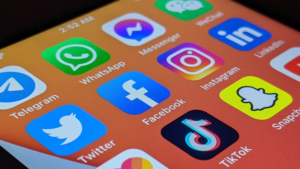
I opened TikTok.
“Just one video,” I told myself, like a fool. One quick dopamine hit to pass the time. Something funny, maybe a dog learning how to skateboard, a satisfying cake-decorating video, or someone absolutely failing at a DIY project. But before I knew it, my boarding group was called, and I had no idea where the last 40 minutes had gone. Had I been hypnotized? Had I slipped into another dimension? No. I had simply fallen victim to The Infinite Scroll Trap—a UX masterpiece so powerful it warps time itself and makes you wonder whether free will is even a thing anymore.
And TikTok isn’t alone in this. Facebook has spent years refining the art of personalized engagement, ensuring that no matter how many times you tell yourself you’re just logging in to check a message, you somehow emerge an hour later, deep in the comments section of a heated debate about whether pineapple belongs on pizza. LinkedIn has gamified career networking, sending just enough notifications to make you feel like you’re on the verge of a major professional breakthrough (even if it’s just someone endorsing you for “Microsoft Word” again).
Before you know it, half the internet has mastered the art of making us think we’re in control—when, in reality, we’re just rats in a very well-designed maze, chasing notifications, engagement loops, and endless scrolling mechanics designed to keep us hooked.
These apps don’t just attract users; they hold them hostage in the friendliest way possible. But what’s their secret? What UX magic makes them so dangerously addictive? And at what point does “smart engagement” cross the line into full-blown psychological warfare?
Grab a coffee, let’s break it down.
1. The Infinite Scroll – TikTok’s Never-Ending Rabbit Hole
Ah, TikTok. The app that has perfected the art of keeping you glued to your screen for hours, only to realize it’s 3 a.m. and you’ve just watched a 20-minute deep dive on why squirrels are secretly plotting against us. TikTok’s infinite scroll is the perfect UX model—it’s simple, it’s addicting, and it knows exactly how to lure you in like a moth to your front door light.
Here’s the magic behind it:
- No searching required – You don’t have to waste time deciding what to watch. The moment you open the app, videos just start playing. Boom. Instant gratification.
- No decision-making required – You don’t even have to make choices. Just flick your thumb, and wallah! You’re onto the next video. It’s the perfect exercise for your thumb and your procrastination skills.
- No natural stopping point – The feed just goes on and on. There’s no “next episode” countdown to let you off the hook. No credits rolling, no “Are you sure you want to exit?” message. Just endless content, pulling you deeper and deeper into the rabbit hole.
Now, here’s where the genius comes in: TikTok has harnessed the Zeigarnik Effect, a cognitive bias that makes us remember unfinished tasks better than completed ones. Since there’s no natural stopping point, your brain keeps thinking, “Just one more video.” And then another, and another, and before you know it, you’ve watched 75 videos on how to make pancakes that look like animals and why cats actually have 9 lives…
So, what can we learn from TikTok’s infinite scroll magic? A lot, actually.
UX Takeaway: The more friction you remove, the more engaged your users will be. TikTok’s entire design revolves around removing obstacles. There’s no delay, no load time, no moment for the user to reconsider or lose interest. They open the app, and boom—content. So, if we want users to engage with our designs, we need to make their journey as easy as possible. Buttons should be obvious, actions should be intuitive, and users shouldn’t be wondering what to do next. The easier you make it for them to take action, the more likely they are to keep going.
But Here’s the Ethical Dilemma: TikTok is designed to keep you scrolling, endlessly. But at what cost? Excessive social media use has been linked to higher anxiety, lower attention spans, and a general decline in mental well-being (Source: CNN). So, as designers, we need to ask ourselves: At what point does “frictionless” cross over into “exploitative”? Is it ethical to optimize user experience just for the sake of engagement, knowing the potential psychological toll it could have?
Sure, making things frictionless and engaging is awesome, but when users are glued to their phones at the expense of their health, we have to wonder if we’re crossing a line. As UX designers, we have a responsibility to design for long-term value—not just immediate gratification. Engagement is important, but so is user well-being.
So, next time you’re considering a smooth, seamless feature like infinite scroll, think about how it will impact your users. Will they love it, or will they be scrolling mindlessly at 2 a.m., unable to find their way out of a TikTok spiral about conspiracy theories surrounding the moon landing and all the drones from New Jersey?
Balance is key. It’s about giving users a great experience without turning them into screen-zombies.
2. The Dopamine Economy – Facebook’s “You Might Like This” Feature
Facebook isn’t just a platform—it’s a well-oiled machine designed to keep you glued to the screen for as long as possible, and let’s be real: it works. While TikTok lures you in with endless, bite-sized videos, Facebook plays the long game with something sneakier: personalization. Facebook knows exactly how to tap into your psychological need for novelty, connection, and a healthy dose of FOMO (fear of missing out). So, what makes Facebook’s UX so… addictive?
Let’s start with their masterful use of variable rewards. If you’ve ever opened Facebook for a quick check, only to find yourself hours deep into an endless scroll of cat videos, friend updates, and your second cousin’s overanalyzing of the latest Netflix hit, you’ve fallen into the dopamine trap. And like a slot machine, you never know what you’re going to get. Maybe it’s an uplifting comment from a friend, maybe a picture of a pet wearing sunglasses, or maybe it’s a 50-comment thread on why pineapple does belong on pizza. Every interaction is a mini gamble, and your brain loves it.
This approach leads to two things: addiction and engagement. Facebook’s algorithm is tuned to keep you hooked with content that feels just personal enough to pull you back for more. Facebook knows what posts will make you feel warm and fuzzy, and which ones will make you want to argue with that random person who commented on your post from last week. But here’s where it gets juicy for UX design: uncertainty drives repeat behavior. As much as we like predictability, humans crave the unknown. If every notification or post was exactly what we expected, we’d scroll past it in a heartbeat. But if you’re unsure of what’s coming next—well, you’re more likely to stay around and see what unfolds.
Now, let’s break down how Facebook specifically maximizes these elements:
- Random Notifications: Facebook has perfected the art of the surprise notification. A friend comments on a photo? Boom. Notification. A potential new friend is tagged in a post? Boom. Notification. Even if it’s something like an old high school buddy’s birthday (you haven’t talked to them in years, but suddenly, you feel like the worst friend ever). The fact that it’s random is what keeps you coming back. You never know if it’ll be a funny post or a mildly awkward invitation to join a group called “Dog Lovers of Suburbia”—but you’ll still check. (Oh, and by the way, Facebook has over 3 billion active users according to Business of Apps, so it’s doing something right.)
- Endless Content Recommendations: You know when you finish reading an article, but Facebook still serves up “related” content that’s somehow always relevant to your life, even though you didn’t think you were interested in something like “How to Build a DIY Treehouse in 5 Days”? Yeah, Facebook does that. The algorithm constantly feeds you new content that feels custom-tailored to your interests, often pulling from your likes, groups, and even who’s commenting on what. It’s a loop of recommendation perfection designed to keep you clicking and scrolling.
- Posts from 5 Days Ago: Sometimes, Facebook’s algorithm doesn’t care about fresh content—it’s going to dig up something that might still get a reaction from you. A post from three days ago? Let’s resurrect that bad boy and see if it sticks. If the algorithm thinks you’ll engage, guess what? You’re getting a reminder. Why? Because Facebook’s UX doesn’t let anything die—it makes sure you never miss out.
The result? Facebook’s engagement is insane, even though its younger demographic is slowly moving to more “immediate gratification” platforms like TikTok or Instagram. It’s still the go-to social platform because it understands how to drag users into a whirlwind of engagement, keeping them scrolling endlessly. It’s less about what users want and more about what will keep them in the app long enough to make a decision. Whether it’s liking, commenting, or sharing that “deep thought” post from an old acquaintance, Facebook makes sure your time is spent interacting.
UX Takeaway:
The personalization that Facebook does right is its ability to adapt the content to the user in a way that feels like it was made for them. It’s not about bombarding users with ads; it’s about making them feel like the content was handpicked. So, while you’re designing your next app or website, remember that personalization can increase engagement, but don’t cross the line into overdoing it. Make the experience feel helpful, not manipulative.
Ethical Question:
Facebook’s algorithm knows exactly what keeps you glued to your screen. But at what point does this become manipulative rather than just good UX? If an app anticipates what you want before you do, is that genius UX or a creeping invasion of privacy? When you personalize, you’re also walking a fine line between making an experience delightful and too delightful. When does the well-oiled engagement machine start looking more like a psychological trap? Should designers be asking themselves if some forms of personalization are doing more harm than good?
Just some food for thought as you consider how much personalization your own designs need—and whether they might eventually lead your users into a never-ending scroll.
3. The LinkedIn Effect – The Professional FOMO Machine
Ah, LinkedIn—land of humble brags, unsolicited career advice, and endless “congratulations” posts that leave you questioning your life choices. While TikTok pulls you in with cat videos and Facebook traps you with endless arguments about pineapple pizza, LinkedIn thrives on something far more insidious: professional FOMO (fear of missing out).
Now, I love a good career highlight just as much as the next person, but have you ever opened LinkedIn just to check in, and suddenly you’re spiraling into self-doubt because everyone and their dog seems to be landing promotions, speaking at industry conferences, or launching their third side hustle? LinkedIn’s algorithm doesn’t help—it loves nothing more than prioritizing posts that trigger a reaction. That means you’re bombarded with “big career moments,” like someone announcing a new job title that’s barely different from their old one, or a colleague posting about their shocking discovery that networking is key to success (thanks, Captain Obvious).
But here’s the trick: LinkedIn feeds on validation. With every notification—someone viewed your profile! Someone endorsed your skills! You’re in the top 5% of something, apparently!—you get a little dopamine hit.
I mean, they’ve perfected it. The “Congrats on the new job” post is a masterpiece of design and social manipulation. It doesn’t matter if the new title is “Director of Director of Operations for Operations”—LinkedIn makes you feel compelled to hit “like” or comment with something supportive like, “Congrats!” even if you’ve never met the person and have no idea what they actually do.
This is all very intentional. In fact, LinkedIn’s engagement has increased by 42% year over year. Why? Because it thrives on positive reinforcement. Every comment, every like, every endorsement is a little victory, a pat on the back. But when does this all stop being a healthy form of engagement and start turning into a digital hamster wheel of anxiety?
UX Takeaway:
The real UX lesson here is simple: Positive reinforcement works—but only if it’s done responsibly. LinkedIn’s algorithm knows what makes people tick, and it plays those emotional strings beautifully. As UX designers, we can take a page out of LinkedIn’s playbook by creating experiences that encourage users to feel good about interacting with our products. The trick, however, is to make sure that we’re empowering users, not just feeding them an endless stream of superficial validation. So, while it’s great to reward users for actions, we need to make sure those rewards don’t turn into a vicious cycle of self-doubt and comparison.
Ethical Question:
At what point does encouraging meaningful engagement cross over into creating a stressful cycle of validation? LinkedIn’s success lies in turning professional FOMO into a game, but as UX designers, we have to ask ourselves: Are we helping users build confidence, or are we just adding more pressure for them to keep up with the Joneses? Every “congratulations” notification might feel good in the moment, but does it really create a meaningful connection with users, or is it just another way to make them feel like they have to be constantly achieving more?
If we’re not careful, engagement strategies can go from being empowering to downright exhausting. So next time you’re designing for engagement, ask yourself: How does this affect the user in the long run?
4. Instagram: The Art of Visual Storytelling and the Illusion of Choice
Instagram isn’t just a social platform—it’s a curated experience designed to keep you engaged, envious, and just a little bit obsessed. While TikTok thrives on endless, unpredictable content and Facebook leans on nostalgia and social validation, Instagram has mastered the art of visual storytelling and making every tap, swipe, and scroll feel intentional—even when it’s not.
Stories: The Perfect FOMO Machine
Instagram Stories are one of the most brilliant UX features ever created. Why? Because they expire. Unlike your main feed, where posts live forever (unless you panic-delete that “felt cute, might delete later” selfie), Stories force urgency.
Users feel a need to check them before they disappear—because what if they miss something? What if their best friend posted a cryptic rant? What if their coworker is on yet another overpriced vacation? Instagram’s UX design taps into this fear of missing out, creating an environment where checking the app feels necessary.
The same goes for Close Friends stories—a feature that adds a layer of exclusivity. Nothing makes you feel more special than realizing you’re on someone’s VIP list. And if you’re not on their Close Friends list? Well, congratulations, Instagram just made you question your entire relationship.
The Illusion of Choice: You’re in Control… Sort Of
Instagram makes you feel like you’re in control of your experience. You follow who you want, engage with what you like, and scroll at your own pace. But behind the scenes? The algorithm is driving the car—you’re just along for the ride.
Your “For You” page? Not really for you—it’s for Instagram’s engagement metrics. The order of posts in your feed? Not chronological, but carefully curated to maximize time spent on the platform. The notifications you receive? Strategically timed to bring you back at just the right moment.
This illusion of control keeps users engaged without feeling manipulated—a UX technique that many apps try to replicate but few execute as smoothly as Instagram.
The Engagement Loop: Why You Keep Coming Back
One of Instagram’s most underestimated UX tactics is how it trains users to engage with the platform even when they don’t realize it.
Ever notice how you double-tap without thinking? That’s because Instagram has conditioned you to associate liking a post with a simple, effortless action. Unlike Facebook’s multi-step reactions, Instagram keeps it stupidly easy to engage—a quick double-tap, a seamless heart animation, and boom—instant validation, no thought required.
This effortless interaction lowers the barrier to engagement while increasing the likelihood of users spending more time on the app. The more you engage, the more tailored your feed becomes, and the more tailored your feed becomes, the more likely you are to keep engaging. It’s a perfectly engineered engagement cycle.
UX Lesson: Make Interactions Effortless but Meaningful
Instagram’s success comes from making engagement feel frictionless while maintaining a sense of personalization. Every action—whether it’s liking a post, swiping through stories, or commenting on a reel—feels effortless, which means users don’t second-guess doing it.
The key takeaway? Reduce friction wherever possible. If you want users to engage, make the interaction feel intuitive, natural, and rewarding—without making them think about it.
The Caffeine Kick: The Data Behind Addictive UX
We all know these apps have a way of hooking us, but what’s the actual data behind this digital sorcery? Let’s break it down and laugh (and cry) at how deep we’re all in.
First up, TikTok. You’ve scrolled through it for hours, and yes, you’ve accidentally swiped into a whole new rabbit hole of dance videos. Turns out, the average user spends 95 minutes per day on TikTok. Yes, 95 minutes. That’s longer than most people’s lunch breaks, longer than an entire episode of your favorite Netflix show, and it’s happening every day (Source: DataReportal). And if you think you’re immune, just try putting your phone down after one video. It’s like trying to close a bag of chips after eating just one.
Then there’s Facebook, which, despite us all saying “I’m done with Facebook” every year, still manages to have 3 billion active users. That’s like 40% of the world’s population. What’s even crazier? It’s still the most-used social platform, even with all the “your Aunt Karen’s conspiracy theories” posts. Facebook’s magic isn’t just in the cute baby pictures; it’s in its ability to keep you hooked. (Source: Business of Apps).
But, what’s the secret sauce here? It’s push notifications. Apps that use push notifications see a 278% increase in user retention (Source: Leanplum). That’s right, folks. One little ping telling you that your friend just liked your post is all it takes to bring you back. It’s the digital equivalent of “Hey, remember me? You need me.” And let’s be honest—who can resist that little red badge saying “1”? You know it’s harmless, but it pulls you right in.
So, what’s the takeaway? Simple: Engagement isn’t just about having a pretty interface or smooth animations—it’s about understanding how our brains work and manipulating it just a little bit. And I mean, who can blame these apps? When you’re the King of the Internet (looking at you, TikTok), why not serve your users a little more dopamine?
But with all this power? Well, as Spider-Man says, “With great power comes great responsibility.” So, while we all have a blast creating these addictive experiences, let’s also remember that, as designers, we should be building with purpose, ethics, and (for the love of sanity) a little self-control. Otherwise, we might just end up with a world where everyone is scrolling aimlessly through TikTok at 3 AM instead of sleeping.
Let’s try not to be the villain, yeah?
Final Thoughts: The Fine Line Between Engagement and Manipulation
Here’s the thing: when apps like Facebook, TikTok, and LinkedIn are at their best, they teach us the holy grail of UX design—frictionless, engaging, and highly personalized experiences that users love.
But when these apps cross that fine line, they quickly go from being helpful tools to digital puppet masters, pulling the strings of our brains while we mindlessly scroll for hours. And let’s be real, they do it all while making us feel like we’re in control. One minute you’re watching a cooking video, and the next you’re knee-deep in conspiracy theory TikToks that you never thought you’d be interested in. It’s like the app knows you better than you know yourself—and, somehow, you’re okay with it.
As UX designers, this is where things get tricky. Sure, we can build delightful experiences that keep users engaged and coming back. But we must also remember that engagement isn’t just about pleasing users. It’s about respecting their time, their attention, and—dare I say—their will to live outside of the app.
Now, don’t get me wrong, creating engaging, addictive experiences isn’t inherently evil. There’s nothing wrong with making your product fun, sticky, or even occasionally a little addictive (hello, I use Instagram too). But there’s a big difference between creating a product that users love and one that they feel like they can’t escape. That’s the slippery slope we walk as designers. At what point does engagement cross the line into manipulation? When does a product go from “this is fun” to “I’ve been scrolling for 3 hours and I haven’t accomplished anything”?
As UX designers, we need to constantly ask ourselves: Are we creating experiences that users genuinely love, or experiences they can’t escape? Are we using our powers for good, or are we just building digital mazes to trap people into endless scrolls?
And hey, if you’re reading this, chances are you’ve spent at least a few late nights getting sucked into the scrolling vortex—so what’s the most addictive app you’ve ever used? Drop it in the comments below. We’re all guilty of falling into at least one of these engagement traps. And don’t worry, I’ll be here to sip my coffee and read your comments. After all, we’re all just trying to navigate the fine line between engagement and addiction, one app at a time.
So let’s make a pact: Let’s design experiences that users love and can walk away from when they need to. Deal? Now, if you’ll excuse me, I’m off to check my phone—just one more TikTok…


Leave a comment