Welcome back, my caffeinated creatives!
Ever wondered why some designs just feel right while others make you want to throw your laptop out the nearest window? It’s not magic—it’s psychology.
From the moment users land on a page, their brains start making rapid-fire decisions about whether they trust it, understand it, and want to engage with it. Before they even read a word, they’ve already formed an impression based on color, layout, and micro-interactions. And when something feels off? Oh, they’ll notice.
UX design isn’t just about making things pretty—it’s about understanding how people think. That’s where cognitive biases, behavioral patterns, and emotional triggers come into play.
So let’s dive into why small design choices trigger big reactions, why users act the way they do (even when it makes zero sense), and how you can use psychology to create experiences people actually enjoy. Grab your coffee, we’ll need it for this one!
Cognitive Biases: The Invisible Puppet Masters of UX
If humans were perfectly logical, UX would be a breeze. Every user would read instructions in full, follow neatly optimized user flows, and never, ever rage-click a button out of sheer frustration. But that’s not how our brains work.
Instead, we rely on mental shortcuts—little cognitive tricks that help us process information faster but also lead us astray. These biases shape every interaction we have online, often without us even realizing it. They determine why we trust some websites instantly and leave others in a blind panic, why we click certain buttons but completely ignore others, and why—despite claiming to want more choices—we freeze when given too many options.
The truth is, our brains are constantly cutting corners. And while that’s great for surviving in the wild (“Big shadow? Probably a bear. Run!!!!!”), it’s less great when navigating an e-commerce checkout flow.
So let’s break down the sneaky ways cognitive biases shape user behavior—and how you, as a designer, can use them for good instead of just watching users suffer.
1. The Aesthetic-Usability Effect: If It’s Pretty, It Must Work Well
Ever forgiven a clunky, slow-loading website just because it looked amazing? Or, on the flip side, dismissed a super-functional product because its UI looked like it hadn’t been updated since Windows XP? That’s the Aesthetic-Usability Effect at work.
Our brains assume that better-looking things work better—even when they don’t.
Why This Happens:
- Humans are visual creatures—we make snap judgments about trust, usability, and credibility within milliseconds.
- A polished, beautiful UI makes users more patient with minor usability flaws.
- Conversely, a cluttered, outdated design makes users assume something is broken—even when it’s functionally perfect.
How to Use It in UX:
- Invest in good visuals. People judge books by their covers, and they absolutely judge websites by their UI.
- Use aesthetics strategically. Want users to engage with a key feature? Make it look better than everything else on the page.
- Don’t let beauty override function. A stunning design won’t save a terrible user experience—but it might buy you enough goodwill to fix the underlying issues.
UX Takeaway: Make it pretty, but also make it work.
2. Hick’s Law: The More Choices, The More Brain Meltdowns
Ever stood in front of a massive Starbucks menu, paralyzed by indecision, despite always ordering the same latte? That’s Hick’s Law.
The more options a user has, the longer it takes them to decide. And when there are too many choices? The brain panics, shuts down, and chooses nothing.
Why This Happens:
- Cognitive overload: The brain only has so much processing power. Too many choices = system crash.
- Fear of making the wrong choice: More options mean more chances to regret a decision.
- The paradox of choice: Sometimes, more is just… too much.
How to Use It in UX:
- Guide users, don’t overwhelm them. Instead of throwing every option at them, highlight the best ones.
- Use progressive disclosure. Show only essential options first, and reveal more if users need them.
- Limit decision points. Amazon’s “One-Click Purchase” isn’t just convenient—it’s genius UX design that bypasses decision fatigue entirely.
UX Takeaway: Fewer, clearer choices = faster, happier users.
3. The Peak-End Rule: Users Only Remember the Highs and Lows
You’d think people remember everything about a user experience, but nope. They mostly remember two things:
✔ The most intense moment (good or bad).
✔ The ending.
That means a bad checkout experience can ruin an otherwise flawless site.
Why This Happens:
- The brain is lazy and doesn’t store every detail—it saves the “highlights” (or lowlights).
- This is why one frustrating moment can make users swear off a product forever.
- On the flip side, ending on a high note can make users forget the frustrating parts.
How to Use It in UX:
- Smooth out friction points. If a user gets stuck, confused, or annoyed, they’ll remember it. Fix the pain points.
- Create a great ending. A delightful success message, a small animation, or even a playful confirmation screen can leave users with a positive last impression.
- Prioritize peak interactions. If there’s a make-or-break moment in your user journey (checkout, sign-up, onboarding), invest in making it great.
UX Takeaway: Users won’t remember every detail—but they WILL remember if it was frustrating or delightful. Make the peaks count.
4. Jakob’s Law: Users Expect Your Site to Work Like Every Other Site
You know that feeling when you land on a site, and nothing is where it’s supposed to be? The menu is hidden, the buttons don’t act like buttons, and you have to think way too hard just to navigate?
That’s a violation of Jakob’s Law—which states that users spend most of their time on other sites. That means they expect your site to work like the ones they already know.
Why This Happens:
- People don’t like learning new interfaces. They just want to get things done.
- Consistency = ease of use. When things behave as expected, users don’t have to think.
- Breaking conventions for no reason is bad UX. Innovation is great—confusing people is not.
How to Use It in UX:
- Stick to familiar patterns. Users expect logos to link to the homepage, carts to be in the top right, and menus to actually function as menus.
- Don’t reinvent the wheel without a reason. Creativity is great, but usability comes first.
- If you break a convention, do it intentionally—and make it obvious. Otherwise, you’re just making life harder for users.
UX Takeaway: Users don’t want to “figure out” your UI—they want to use it. Make it familiar.
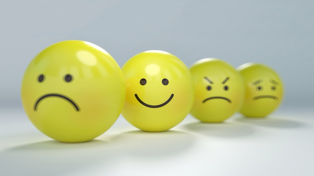
Why Small Design Choices Trigger Big Reactions
Words have power, but in UX, the smallest words have the biggest consequences. The difference between “Submit” and “Let’s Go” might seem trivial, but one is lifeless and transactional, while the other feels inviting. Likewise, an error message that simply states “Your payment failed” is way more jarring than “Hmm… something went wrong. Let’s try that again.”
These tiny shifts in tone can drastically change how users feel about an interaction. A robotic, impersonal message makes users feel like they’ve done something wrong, while a warm, conversational approach reassures them that everything is under control.
This is why brands like Slack, Duolingo, and Notion spend time crafting their microcopy to feel human, not corporate. Slack doesn’t just say, “Loading…” It says, “Rubbing some sticks together…” It’s a small touch, but one that makes users feel like they’re engaging with something friendly and intentional, not a cold, faceless system.
And the results? Huge. Studies have shown that small tweaks to microcopy can increase conversion rates by double digits. A single word change—like switching “Sign Up” to “Get Started”—can dramatically impact engagement.
The takeaway? Words matter. And in UX, the fewer the words, the more important they become.
Button Design: The Illusion of Control
We like to think we make rational choices when we interact with digital interfaces, but in reality, our brains are wired to be drawn to certain visual cues. This is especially true when it comes to buttons.
Some buttons just beg to be clicked, while others feel like they’re hiding in plain sight. Why? Because button design isn’t just about function—it’s about psychology.
Color is one of the biggest influencers. Red makes us feel urgency. Green signals “go.” Blue builds trust (which is why every tech company under the sun uses it). But it’s not just about color—shape and size also impact how users interact. Rounded buttons feel friendlier and more inviting, while sharp-edged buttons feel more formal and structured. Too small, and users won’t even see it. Too big, and it looks desperate.
Think about how many times you’ve ignored a tiny, gray “Skip” button and accidentally clicked on the bold, colorful “Try Free for 30 Days” button instead. That’s not by accident. Designers understand that the way a button looks determines whether or not users will click it.
It’s all about creating an illusion of control. A well-designed button doesn’t just look nice—it subtly guides users toward the action the business wants them to take.
Progress Bars & Loading Screens: The Psychology of Waiting
People hate waiting. But you know what they hate even more? Not knowing how long they’ll have to wait.
This is why progress bars and loading animations exist—not just to inform users that something is happening, but to make waiting feel shorter.
Studies have shown that people perceive loading times to be significantly faster when there’s a progress indicator, even if the actual time hasn’t changed. A cleverly animated loading screen tricks the brain into thinking time is moving faster than it actually is.
Instagram does this brilliantly. When you refresh your feed, instead of freezing the screen while content loads, the app smoothly pulls the feed down and shows a spinning animation. It gives users the illusion of momentum, even when nothing is happening behind the scenes.
This same principle applies to skeleton screens—the placeholder gray boxes you see when content is still loading. Instead of making users stare at a blank screen, skeleton screens suggest that progress is happening, even if it’s not. The result? Users are less likely to abandon the experience.
The key takeaway? Perception is everything. Even if you can’t make something load faster, you can make it feel faster with the right design choices.
Small Choices, Big Impact
At first glance, things like button styling, progress indicators, and word choice seem like minor details—like debating whether to put the milk in before or after the cereal. But they aren’t. They’re the difference between a frustrating, forgettable experience and a seamless, engaging one.
A button that blends into the background? That’s a game of “Where’s Waldo?” nobody asked to play.
A robotic error message? Congratulations, your app now sounds like it was written by a fax machine.
A loading screen with no indication of progress? That’s how you convince users their internet died, their device froze, and their life choices are in shambles—all at the same time.
The best UX isn’t about reinventing the wheel. Sometimes, it’s about understanding how people think and making sure your design aligns with how their brains actually work (which, let’s be real, is 50% logic and 50% panic).
So next time you’re designing a product, ask yourself:
- Does this button stand out enough to be clicked—or is it hiding in plain sight like a bad spy?
- Does this message sound human—or like it was drafted by a customer service chatbot in 2007?
- Are we making users wait without telling them what’s happening?
Because in UX, the smallest changes make the biggest difference. And if you don’t believe me, try renaming your “Submit” button to “Click Here, I Guess” and watch your conversion rates plummet.
The Caffeine Kick: What the Data Says About UX Psychology
If you’ve ever judged a coffee shop based on its vibe before even taking a sip, congratulations—you’re just like every user on the internet. First impressions happen fast, and once a user decides they don’t like what they see (or experience), getting them to stick around is about as easy as convincing someone that gas station coffee is “actually pretty good.”
But let’s move past gut feelings and dive into the cold, hard data on how UX psychology shapes user behavior. Because while we love a good hunch, it turns out science has some pretty compelling receipts.
First Impressions: Your Users Are Judging You Faster Than You Think
94% of first impressions are design-related.
Google Research found that nearly all initial judgments about a website come down to design, not content. In other words, your well-researched, beautifully written case study means nothing if your site looks like it hasn’t been updated since Internet Explorer was relevant.
Users form an opinion about your website in just 50 milliseconds.
According to the Behaviour & Information Technology Journal, users take about 0.05 seconds to decide whether they like a website or not. That’s faster than you can say “bad kerning.” Essentially, your website has the same amount of time to impress a visitor as a Tinder profile—so make that first glance count.
The Takeaway
Design isn’t just about aesthetics—it’s a psychological shortcut. Users assume that if something looks polished, it must work well. This is called the “Halo Effect”, where a positive first impression leads people to believe the entire experience will be good. On the flip side, if your UI looks janky, users assume the rest of your experience will be just as frustrating.
Speed Kills… Your Conversion Rates
53% of mobile users abandon a site if it takes longer than three seconds to load.
According to Google, over half of users will give up on your site if it’s even a little slow. Three seconds might not sound like much, but in internet time, that’s the equivalent of waiting in line for coffee while someone counts exact change in pennies.
A one-second delay in page load time can reduce conversions by 7%.
Akamai found that even the tiniest bit of lag can impact your bottom line. That means if your site is slow, you’re literally leaving money on the table. Or worse—driving users straight into the arms of your competitors.
The Takeaway
We are impatient creatures. The brain is wired to crave instant gratification, and if your page doesn’t load fast enough, users assume it’s broken, outdated, or just not worth their time. Use speed optimization tools, lazy loading, and compressed images, because no one—and I mean no one—has the patience to watch your site load like it’s still 1999.
The UX of Loyalty: Users Remember Bad Experiences… Forever
88% of users say they won’t return to a site after a bad experience.
According to Maze, if your UX frustrates people, you won’t get a second chance. Ever rage-quit an app and sworn never to open it again? Exactly. Bad UX is like getting a burnt espresso shot—people will hold a grudge.
Consumers place high importance on ‘previous good UX with the brand’ as their top criteria when considering a new purchase.
Harvard Business Review found that customers return to brands not just because of their products but because of the experience they had last time. Good UX = repeat customers.
The Takeaway
Users don’t just remember bad experiences—they tell their friends. The average unhappy customer will share their experience with 15 people (or, you know, everyone on Twitter). Meanwhile, brands that prioritize UX build long-term loyalty because customers remember when things just work.
The Business Case for UX: Why It Pays to Prioritize Design
Every $1 invested in UX brings an average return of $100.
A study from UserGuiding found that UX has an average ROI of 9,900%. That’s not a typo. Great UX isn’t just good design—it’s good business.
A well-designed UI can increase a website’s conversion rate by up to 200%, and a better UX design can achieve conversion rates of up to 400%.
ExpertBeacon found that making UX a priority isn’t just about making things look nice—it directly impacts how many users take action.
The Takeaway
Want to convince stakeholders that UX matters? Hit them with the numbers. A fast, frictionless, user-friendly experience isn’t just a nice-to-have—it’s the difference between a thriving business and one that loses customers faster than a confusing checkout process.
Your UX Decisions Have Psychological Consequences
Users don’t experience design logically. They don’t sit down, analyze your UI, and think, “Hmm, the information hierarchy on this page is quite compelling.” No, they feel it. They love it. They hate it. They remember it.
The right microcopy makes a button feel inviting.
The right color choice makes an action feel urgent.
The right speed makes an experience feel effortless.
And the wrong choices? Well, they send users running.
So, next time you’re refining a UI, running an A/B test, or advocating for that one UX decision that everyone keeps trying to cut, just remember—good design isn’t just about looks. It’s psychology. And if your UX is great, your users will thank you… with their clicks, their time, and their loyalty.
Now, go forth and design experiences people actually want to use. And if someone asks you to add just one more pop-up, remind them: science says no.
Final Thoughts: UX Isn’t Just About Design—It’s About People
At the end of the day, great UX isn’t just about pushing pixels, making things “pop,” or creating the sleekest, most modern-looking interface. It’s about understanding people—their habits, their expectations, and, let’s be honest, their irrational quirks.
Because let’s face it:
✔ Users don’t read—they scan. (Which is why your beautifully crafted paragraph explaining a new feature will be completely ignored in favor of a single bolded sentence.)
✔ They don’t remember everything—just the highs and lows. (Like the one time your app crashed in the middle of their purchase. They will never forget that.)
✔ They don’t want more choices—they want the right ones. (Give them too many options, and they’ll freeze like a deer in the headlights—then abandon your product entirely.)
Designing for psychology isn’t about manipulation—it’s about making life easier for the people using your product. It’s why Netflix auto-plays previews (because if you had to manually decide what to watch, you’d scroll for hours and give up). It’s why Amazon’s “Buy Now” button exists (because they know the second you start overthinking your purchase, you’ll talk yourself out of it).
Great UX anticipates the chaos of human decision-making and guides users without them realizing it. It’s the art of making an interface so intuitive that people don’t even notice the design—they just know everything works.
So, next time you’re finessing a button, rewriting microcopy, or debating the exact speed of a loading animation, remember: the tiniest details shape the biggest experiences. Get them right, and your users will feel like the product was made just for them. Get them wrong, and… well, you might just end up in the next viral UX rant on Twitter.
Now, let’s hear it—what’s a UX decision that drives you absolutely nuts as a user?
Endless cookie pop-ups? Mystery-meat navigation? A checkout process that feels like an escape room challenge? Drop it in the comments—I’ll bring the coffee.


Leave a comment