Welcome back, my caffeinated creatives!
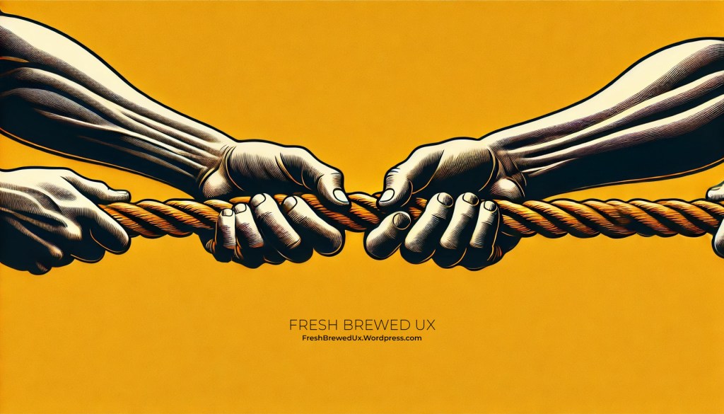
Today, we’re diving into one of the biggest tug-of-wars in UX—giving users what they actually need while fending off stakeholder requests that threaten to turn your design into a Frankensteined mess of executive-driven “must-haves.”
For a little background on me, my approach to UX didn’t follow the typical “art school to agency” pipeline. Instead, I took a different route, earning a degree in Business Leadership & Management (B.A.) with a minor in Communications to understand how businesses actually tick—what motivates them, what keeps execs up at night, and why they love dashboards so much.
Having this foundation has given me a unique superpower—translating “we need to increase conversions” into design that actually makes sense for users. It’s helped me see UX beyond just wireframes and prototypes and instead as a negotiation between what users want and what businesses think they need (which, spoiler alert, is sometimes way off).
If you’ve ever designed a seamless, user-friendly experience only to have a stakeholder say, ‘We need to add more features so we look competitive’—congratulations, you’ve just witnessed the purest form of UX vs. business goals. The business wants to check all the boxes, but the user wants a simple, intuitive experience. And you? You’re stuck in the middle, trying to keep the product from turning into a cluttered mess of features no one actually asked for.
This is the tightrope we walk: prioritizing the user experience while keeping the people who sign the paychecks happy. It’s about delivering seamless, intuitive interactions for users while ensuring the business achieves its revenue goals, increases conversions, and meets stakeholder expectations.
So how do we bridge the gap between what users need and what stakeholders think they need? Grab your coffee, let’s talk strategy.
The Stakeholder vs. User Dilemma
Here’s the thing—stakeholders and users have very different priorities.
- Users want an intuitive, frictionless experience that helps them accomplish their goals quickly and efficiently.
- Stakeholders want a product that increases revenue, drives engagement, and impresses investors—even if that means making design decisions based on personal opinions, gut feelings, or what their cousin Todd thought looked cool back in 1997.
Neither side is wrong, but when business objectives start steamrolling usability, things get messy fast. Ever used an app where every feature felt like it was designed for someone’s boss instead of actual customers? You know the ones—bloated dashboards, a million unnecessary pop-ups, and a navigation menu so confusing it might as well require a treasure map. That’s what happens when internal priorities take precedence over user needs.
But let’s be fair—UX doesn’t exist in a vacuum. We’re not designing for the sake of aesthetics or for a theoretical perfect user experience that ignores business realities. A beautifully designed, hyper-intuitive product that doesn’t help the business grow is just as much of a failure as a revenue-driven platform that frustrates users into rage-quitting.
So how do we find the balance—keeping both users and stakeholders happy without losing our sanity in the process?
Common UX vs. Business Goal Traps (And How to Escape Them)
Let’s talk about the biggest pitfalls you’ll encounter when trying to balance UX with business goals—and how to navigate them without sacrificing usability.
1. The “Our Users are Experts…Just Like Me!” Stakeholder Opinion Trap
This is one of the most common UX roadblocks: a stakeholder dismisses a feature, navigation element, or flow simply because they personally wouldn’t use it. It’s like saying, “I don’t drink oat milk, so no one else does either.”
A Personal Experience: The Security Software Saga
I once worked with a security software company that hired us to redesign their website and marketing collateral. The CEO, an absolute expert in his field, was deeply involved in every decision—and by deeply involved, I mean he could have written an entire dissertation on cybersecurity theory before approving a single headline.
Every meeting felt like a masterclass in complex security principles—except I wasn’t the student, I was the designer trying to create a website that actual customers could understand. The copy he dictated? So dense that even a PhD student in cybersecurity would need a second read. He was referencing theories, niche industry jargon, and concepts so obscure they probably belonged in a research paper, not a homepage.
We tried everything—user research, competitor comparisons, A/B testing, content simplification workshops—you name it. But every attempt to make the messaging clearer was met with, “Well, that’s not technically how we describe it in the security world.”
By the end of the redesign, the client was thrilled—which, in theory, should have been a win. But here’s the kicker: even I, the person who designed the entire site, still had no clue what the company actually did. If I, as an everyday potential customer, couldn’t understand their value proposition after months of working on it, what chance did their actual users have?
This is why stakeholders aren’t always the best judge of what resonates with customers. They live and breathe their product. They’re experts. But the average user is not. And if your website, app, or product messaging only makes sense to your CEO, you’re designing for an audience of one.
2. The “Make It Pop” Trap
Ah yes, the infamous “Can we make it pop?” feedback. What does that even mean? Neon colors? Explosions? A parade of animated UI elements? When stakeholders ask for things to “pop,” they’re often struggling to articulate a legitimate UX concern—like poor hierarchy, unclear calls-to-action, or a lack of contrast.
Why It’s a Problem:
This vague feedback often leads to over-stylized, gimmicky, or visually chaotic designs that detract from usability. It prioritizes aesthetics over function, often without solving the underlying problem.
How to Escape:
- Translate the request into an actionable design goal. Ask, “Are you concerned that users aren’t noticing this? Would you like higher contrast? More emphasis? Improved placement?”
- Use data to guide decisions. Heatmaps, click tracking, and A/B tests can reveal whether something is truly being overlooked—or if it’s already working just fine. (For example, I had a client that was insistent that users weren’t even using their tabbed module on a page because they just “bounced” after landing on the page. Come to find out after reviewing Hotjar heatmaps that the module was the #1 most clicked area on the page, it was the content that was scaring the users away!)
- Educate on design principles. Sometimes, explaining how visual hierarchy, white space, and contrast work can help stakeholders understand why making it pop isn’t always the solution.
3. The “Every Page Needs a CTA” Trap
Ah yes, the age-old belief that more buttons = more conversions. Because clearly, if one Sign Up Now! button is good, then five must be better! Why stop there? Let’s throw in a floating CTA, a flashing banner, and maybe even a popup asking users if they’re REALLY sure they don’t want to subscribe.
Except… that’s not how human psychology works.
Why It’s a Problem:
When every page is screaming for attention, users don’t know where to focus. Instead of guiding them toward a clear next step, you’ve just built a Choose Your Own Adventure book where every page leads to a different CTA cliffhanger.
The result? Decision fatigue. Too many competing buttons, banners, and popups make users more likely to bounce than convert. If everything is urgent, nothing feels important.
How to Escape:
- Emphasize quality over quantity. A single well-placed CTA, positioned at the right moment in the user journey, is far more effective than a dozen competing ones fighting for attention.
- 2. Guide stakeholders through a logical journey. Instead of ambushing users with calls-to-action at every turn, structure the experience so that each page naturally leads them to the next step—without feeling like a desperate sales pitch.
- Use A/B testing. There’s nothing like cold, hard data to prove a point. Test fewer, strategically placed CTAs against an overloaded mess of buttons and watch the conversion rates speak for themselves.
Because let’s be real—if users have to close three popups just to read your content, there’s a good chance they’re closing the entire page next.
4. The “More Features = More Value” Trap
There’s a special kind of optimism that some stakeholders have—the belief that the more features a product offers, the happier the users will be. Because obviously, customers have endless free time to learn every bell and whistle, and nothing excites them more than a dashboard packed with 37 tabs, 12 dropdowns, and a settings menu so dense it needs a search bar of its own.
I once worked with a financial services client who was insistent that their customers—busy professionals making high-stakes decisions—would love having an overwhelming number of tools, reports, and customization options. After all, “our users are smart! They have resources! They like to be in control!”
And sure, they were smart. But you know what smart people don’t like? Spending 20 minutes hunting for the one feature they actually need while wading through a sea of tools they’ll never use.
The result? Instead of helping users convert into paying customers, these extra features became distractions. They weren’t delighting users—they were delaying them. And when people get overwhelmed, they leave.
Why It’s a Problem:
More features do not automatically mean more value. In fact, feature bloat can make a product worse by:
- Diluting core functionality. Users have a harder time finding the actual useful tools when they’re buried under a pile of “nice-to-haves.”
- Increasing cognitive load. The more complex an interface gets, the harder it is for users to make decisions. And when people feel overwhelmed, they abandon ship.
- Driving up costs. More features mean more development, maintenance, and support. If users don’t even use half of them, you’re literally paying for confusion.
How to Escape:
- Prioritize ruthlessly. Just because you can add a feature doesn’t mean you should. Focus on solving real user problems, not just keeping up with competitors’ feature lists.
- Use analytics to evaluate feature adoption. If a feature isn’t widely used, ask whether it should be refined, removed, or left alone. Don’t just assume more is better.
- Educate stakeholders on the importance of simplicity. Sometimes, less really is more. If users can’t easily find value, they won’t stick around long enough to care.
Because at the end of the day, users don’t want a buffet of features—they want the right ones, in the right place, at the right time.
The Caffeine Kick
We all know that a well-crafted user experience is like the perfect cup of coffee—smooth, satisfying, and keeps customers coming back for more. But let’s grind down to the numbers to see just how much impact good UX can have on your business:
- Conversion Rates: A well-designed UI can increase a website’s conversion rate by up to 200%, and a better UX design can achieve conversion rates of up to 400%. (maze.co)
- Return on Investment (ROI): On average, every dollar invested in UX brings 100 dollars in return. (eleken.co)
- User Retention: 88% of internet users are less likely to return to a website after a poor user experience. (maze.co)
- Repeat Customers: Consumers place high importance on ‘previous good CX with the brand’ as their top criteria when considering a new purchase. (maze.co)
The takeaway? Investing in UX isn’t just about making things look good—it’s about brewing a business strategy that delights users and drives success.
Final Thoughts: UX Designers or Business Therapists?
Finding the right balance between user needs and business goals is challenging—kind of like trying to carry a full cup of coffee across the office without spilling it while someone follows behind you shouting, “We need more pop-ups! Add a chatbot! Make the CTA flash!”
The key isn’t just pushing back—it’s framing UX in a way that stakeholders actually understand. We can’t just be designers; we have to be consultants, translators, and even mediators between user needs and business priorities. When we speak their language—impact, conversions, customer retention, long-term brand loyalty—suddenly, they’re all ears.
But let’s be real: some stakeholders will never budge. No matter how many research studies, competitor comparisons, or A/B tests you present, they’ll cling to their personal opinions like my security software client, who was so convinced that his industry jargon-filled website would be a game-changer—despite the fact that even I, the person designing it, had no idea what his company actually did.
At the end of the day, great UX isn’t just about making things look good for a pitch deck. It’s not about adding “cutting-edge features” just to impress investors. It’s about designing experiences that actually work—for the people who matter most: the users. Because a pretty product that nobody wants to use? That’s just expensive digital clutter.
So now, over to you—what’s the wildest stakeholder request you’ve ever had? A homepage with ten competing CTAs? A landing page that needed to “look like Apple, but not exactly”? Let’s hear it in the comments. I’ll bring the coffee.


Leave a comment