Welcome back, my caffeinated creatives!
As UX designers, we spend our days meticulously optimizing buttons, tweaking microcopy, and trying to convince our clients that adding more dropdowns won’t magically fix their conversion rates. But let’s be real—great UX isn’t just found on our computer screens. It’s everywhere.
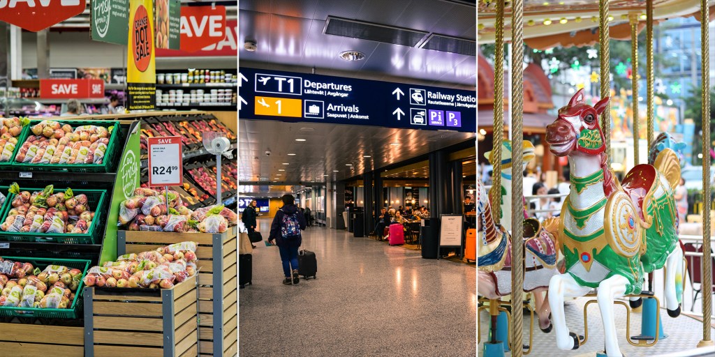
Ever tried to navigate a grocery store, only to end up somehow back in the snack aisle, debating whether you need another bag of chips? Or stood in an airport security line long enough to start questioning your entire life? Or maybe you’ve wandered through a theme park without a map, yet magically found your way to the nearest churro stand?
That’s not luck. That’s real-world UX in action. Some places nail it, making the experience smooth and enjoyable, while others turn basic tasks into frustrating endurance challenges that test your patience and willpower.
So today, we’re stepping away from Figma (just for a second, I swear) and diving into the UX of everyday life to dissect real-world spaces like grocery stores, airports, and theme parks to discover what they can teach us about user flow, intuitive design, and why some experiences leave us smiling while others leave us rage-tweeting.
Top off your coffee, we’re going to need all the caffeine we can handle to face the real-world!
Grocery Stores: The Psychology of User Flow
Grocery stores are basically giant UX experiments disguised as places to buy cereal. Every aisle, every product placement, every “limited-time” display of cookies you didn’t plan to buy but suddenly need—it’s all carefully designed to manipulate your shopping behavior. You’re not just grocery shopping; you’re unknowingly navigating one of the most sophisticated user experiences out there.
Think about it: why is the milk always in the back? Why do you enter through an area full of bright, fresh produce like you’re about to embark on a health-conscious journey…only to leave with a cart full of snacks and an extra pint of ice cream? Because grocery stores understand user psychology better than most websites ever will.
That sounds a lot like UX, doesn’t it? Designing for behavior, subtly guiding users without them feeling manipulated, and making the experience feel effortless—these are the same principles we obsess over in digital design. The only difference? When a grocery store gets it wrong, you end up lost in the bread aisle, rethinking your life choices. When a website gets it wrong, users bounce in under five seconds.
So, what can we learn from grocery store UX—and more importantly, how can we use their sneaky strategies for good instead of just selling more impulse buys at checkout?
1. First Impressions Matter: The Fresh Produce Trick
Ever noticed that the first thing you see in nearly every grocery store is the fresh produce section? That’s no accident. Seeing bright, colorful fruits and vegetables right away makes you feel good—it sets a positive tone for your shopping experience. Studies even show that shoppers who start with produce are more likely to make healthier choices throughout their trip (source).
Digital takeaway: First impressions shape how users perceive your site or app. Whether it’s your homepage, onboarding flow, or the first screen of a product, make sure it creates the right emotional response.
2. The “Milk in the Back” Rule
You know how the most essential items—milk, bread, eggs—are always at the back of the store? Grocery stores do this on purpose because it forces you to walk past everything else first. The more products you see, the more you’re likely to buy on impulse.
Digital takeaway: Be strategic about where you place high-value actions. Want users to explore more of your site before converting? Design the journey to encourage discovery while still making sure they can reach their goal easily when they’re ready.
3. Choice Paralysis is Real
Too many options can be overwhelming. Walk into the cereal aisle and you’ll see dozens of brands competing for your attention. But research shows that when consumers are given too many choices, they’re more likely to freeze and walk away without making a decision (source).
Digital takeaway: If your site or app presents users with too many decisions at once, they might not choose anything at all. Curate the experience to reduce friction—progressive disclosure, clear calls-to-action, and simplified choices can make decision-making easier.
Airports: The UX of Managing Chaos
Airports are the ultimate UX stress test, where usability meets panic, poor time management, and questionable food choices. Unlike grocery stores—where most people can at least fake confidence while searching for peanut butter—airports throw thousands of confused, jet-lagged, half-dressed-in-security-line travelers into a high-stakes obstacle course.
A well-designed airport is one where you glide from check-in to your gate without breaking a sweat. A poorly designed airport? That’s when you see people wandering aimlessly, staring at unintelligible signs, or breaking into a full sprint like they’re starring in Mission: Impossible – Missed Flight Protocol.
The stakes are high. One wrong turn, and you’re trapped in the Bermuda Triangle of terminals, somehow five miles from your gate despite being inside the same building.
So, how do airports design for usability at scale? And why do some feel like a breeze while others make you question your life choices? Let’s break it down.
1. Universal Signage = Instant Understanding
Think about airport signs. No matter what country you’re in, you recognize the baggage claim icon, the restroom symbol, and the security checkpoint directions. You don’t need to read long explanations because the visual cues instantly communicate meaning.
Digital takeaway: In UX, icons, colors, and layout should communicate function immediately. Confusing labels, abstract icons, or inconsistent navigation add unnecessary cognitive load—good design should minimize thinking.
2. Bottlenecks Make or Break the Experience
There’s a reason TSA security lines are universally loathed—they’re the slowest, most frustrating part of air travel. No one enjoys standing in a bottleneck, especially when they don’t know how long it will take.
Digital takeaway: If your site or app has a point of friction—like checkout or onboarding—make it as painless as possible. Add progress indicators, set clear expectations, and optimize speed wherever possible.
3. Fast Passes and Priority Access Work
Want to skip the TSA line? You can—if you pay for it. Airports (like websites) know that some users will gladly pay extra for a better experience. Just like TSA PreCheck, e-commerce sites use express checkout, and streaming services use ad-free premium options.
Digital takeaway: If your product has a high-friction process, consider offering a premium shortcut for users who value efficiency.
Theme Parks: Designing for Delight
If airports are a UX stress test designed to break your spirit, theme parks are a masterclass in making people willingly stand in line for hours and somehow enjoy it. Unlike airports, where people are just trying to survive until they reach their gate, theme parks are places people actually want to be—which means their UX approach is a whole different ball game.
The goal isn’t just to make things functional. It’s to make every second enjoyable, immersive, and just distracting enough that you don’t notice how much money you’re spending.
Think about it—theme parks deal with the same UX nightmares as digital products: massive crowds, long wait times, users (aka visitors) who have no idea where they’re going, and the constant challenge of keeping people engaged. But while a bad airport experience leaves you questioning your will to live, a long day at a theme park somehow still feels exciting, memorable, and worth every penny (even after paying $12 for a soda). That’s not magic—it’s UX done right.
Theme park designers, much like UX designers, map out the entire user journey from start to finish. They predict visitor behavior, design spaces that effortlessly guide you to your next adventure, and sprinkle in subtle psychological tricks to make the experience feel seamless (and yes, to encourage you to spend more money).
So, what can we steal from the UX masterminds behind the happiest places on earth?
1. Pathways That Just Make Sense
Ever notice how you never really feel lost in a well-designed theme park? That’s because you’re never supposed to. Even without a map, you instinctively know where to go next.
Theme parks achieve this through:
- Clear sightlines – Key attractions are always visible in the distance, creating natural waypoints.
- Curved pathways – Instead of long, straight roads (which can feel overwhelming), parks use subtle curves to create a sense of discovery.
- Layered signposting – Large directional signs guide first-time visitors, while subtle environmental cues (like themed pathways or sounds) help more experienced visitors find their way.
Digital takeaway: Good UX design should feel just as effortless. Navigation should be so intuitive that users don’t need to stop and think. If people are struggling to find their way around your site or app, that’s a sign you need to rethink your information architecture.
2. The Illusion of Shorter Wait Times
Waiting in line is the physical-world equivalent of a slow-loading website—except at a theme park, that wait can last hours. And yet, people put up with it. Why? Because theme parks have figured out how to make waiting feel like part of the experience instead of just wasted time.
Ever noticed how some ride queues have interactive elements, themed environments, or “stages” that break up the line? That’s all by design. Parks use:
- Pre-show experiences – A mini attraction or storyline that builds excitement before the main ride.
- Visible progress indicators – Signs that say “45 minutes from this point” help set expectations (instead of leaving people guessing).
- Background music & entertainment – Keeps people engaged while they wait, reducing perceived boredom.
Digital takeaway: Perceived speed is just as important as actual speed. If your site or app has load times, don’t leave users staring at a blank screen. Engage them with progress bars, animations, microinteractions, or useful content to make the wait feel shorter.
3. Gamification Keeps Users Hooked
Theme parks don’t just guide users through an experience—they actively encourage them to stay longer and engage more deeply. A great example of this is Disney’s MagicBands, which gamify everything from ride access to restaurant check-ins. Visitors earn perks, unlock surprises, and track progress—turning the park experience into an interactive game.
And it works. People love tracking achievements, whether it’s collecting all the hidden Mickeys, hitting every ride in a single day, or racking up loyalty points. This taps into the same psychology that makes progress bars, streaks, and badges so addictive in digital UX.
Digital takeaway: Reward users for their engagement. Whether it’s badges, progress tracking, milestone unlocks, or VIP perks, small incentives can increase retention and keep users engaged longer.
The Caffeine Kick
By now, we’ve aimlessly walked the aisles of grocery stores, survived the stress gauntlet of airports, and willingly waited in ridiculous lines at theme parks (seriously, how do they make us excited to stand still for 90 minutes?). But let’s talk cold, hard UX facts—because as much as we’d love to believe users are patient, thoughtful creatures who carefully evaluate every experience, science says otherwise.
Fact: 94% of first impressions are design-related
That’s right—94%. Users aren’t making an informed decision about your website based on your brilliant content or rock-solid business model. Nope. They’re judging your entire existence based on how it looks in the first few seconds. (source)
That’s the digital equivalent of walking into a grocery store and immediately feeling lost, or stepping into a theme park and realizing there are no signs, no maps, and you have no idea where the roller coasters are. If people don’t get a clear, positive first impression, they’re gone faster than a Disneyland churro at snack time.
The takeaway? Invest in strong visual hierarchy, intuitive navigation, and clear user flows—because if your UX is confusing at first glance, it doesn’t matter how great the content is. People won’t stick around to find out.
Fact: 75% of people judge a website’s credibility based on aesthetics alone
We love to think people make rational decisions, but let’s be honest—ugly websites just feel sketchy. (source)
Ever walked into a run-down grocery store where the shelves are half-empty and the flickering lights make you question your life choices? Or visited a theme park with peeling paint and creepy animatronics that look like they’ve seen things? That gut feeling of “I don’t trust this place” is exactly what happens when users land on a cluttered, outdated, or poorly structured website.
The takeaway? Good design builds trust. Even if your product or content is top-tier, an outdated or chaotic UI will make users subconsciously trust it less. First impressions aren’t just important—they determine whether people believe in your brand at all.
So, whether you’re designing a website, a theme park, or an airport, remember this: People aren’t rational. They judge fast, they trust design over logic, and they really, really don’t want to feel lost. Make it easy, make it seamless, and—if all else fails—at least make it look good.
Final Thoughts
UX isn’t just about what happens on a screen—it’s everywhere. The way grocery stores guide our shopping habits, the way airports direct massive crowds, and the way theme parks create effortless, immersive experiences are all examples of user experience design in action.
Good UX doesn’t always mean reinventing the wheel. Sometimes, it means studying what already works in the real world and bringing those principles into digital design. Grocery stores teach us about user flow, airports show us how to manage complexity, and theme parks reveal the power of engagement and delight.
So, next time you’re frustrated in an airport security line or lost in the grocery store snack aisle, pay attention—there’s probably a UX lesson hiding in plain sight.
What’s the best (or worst) real-world UX experience you’ve ever had? Let’s grab a coffee and chat!


Leave a comment