Welcome back, my caffeinated creatives!
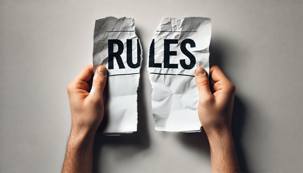
Ah, best practices. The holy grail of UX. The thing that gets tossed into every design meeting as if invoking its name alone will guarantee a seamless, intuitive, and award-winning user experience.
Except… does it?
If best practices were a guaranteed formula for success, every website and app would be effortless to use, engagement rates would be through the roof, and nobody would ever feel the urge to aggressively mash their mouse in frustration. And yet, here we are—half the internet feels like a collection of slightly different variations of the same five templates, while the other half ambushes users with “Sign up now!” pop-ups before they’ve even had a chance to breathe.
Best practices exist for a reason—they help prevent usability nightmares, ensure accessibility, and create experiences that (in theory) make life easier for users. But when applied without thought, they can also strip away originality, block meaningful innovation, and leave us with designs that feel safe, predictable, and, frankly, forgettable.
So today, we’re diving into the tricky balance of when best practices work, when they don’t, and when breaking the rules is exactly what your design needs.
UX Best Practices: The Good, The Necessary, and The Overdone
Before we get into why sometimes best practices are actually worst practices, let’s start with the ones that are non-negotiable.
Best Practices That Actually Make Sense
Some rules are there because they work. Ignoring them won’t make you an innovator—it’ll just make users frustrated. Here are a few that are actually worth following:
- Keep navigation intuitive – Nobody wants to be on a scavenger hunt just to find the “Contact Us” page.
- Make text legible – If your font is microscopic or blends into the background, you might as well write in invisible ink.
- Prioritize accessibility – A great UX is great for everyone, not just people with 20/20 vision and the latest iPhone.
- Ensure proper contrast – If your call-to-action button blends in with the background, it’s less of a “call” and more of a whisper.
- Don’t reinvent the wheel without a good reason – Users expect certain things. For example, If you’re replacing the standard “X” button with something quirky (or worse, hiding the close option altogether – especially on a pop-up!) you’re not innovating—you’re just trapping people.
These principles help prevent usability disasters, ensure accessibility, and keep users from throwing their devices in frustration. But then there are the best practices that get followed just because “that’s how it’s always been done.”
And that’s when things get boring.
When Best Practices Backfire (Or Why Every Website Feels the Same)
You know the look.
The massive hero image. The three-column “Our Services” section. The big, generic CTA button urging you to “Get Started.”
It’s not that these things are bad—it’s that they’ve become so predictable that they barely register with users anymore. When everything starts looking the same, it becomes harder to make a lasting impression.
Best practices tell us to:
- Keep things simple → But sometimes that strips away personality.
- Follow familiar layouts → But too much familiarity = forgettable experiences.
- Reduce cognitive load → But at what point does removing complexity remove meaning?
Best practices work—until they don’t. When everything starts blending together, it’s time to rethink the rules.
Rule-Breaking Wins: When Ignoring Best Practices Paid Off
Apple Kills the Home Button (And Somehow, We Survived)
Best Practice: Keep navigation clear and visible.
How They Broke It: Removed all physical buttons and replaced them with gestures.
When Apple ditched the home button on iPhones, UX Twitter (X) lost its collective mind. Conventional wisdom said that navigation should be obvious, consistent, and labeled. Apple? They took that rule, set it on fire, and introduced gesture-based navigation instead.
On paper, this sounded like a usability nightmare—but it worked. Once users got used to it, gesture-based navigation became faster, smoother, and more natural. It wasn’t about breaking a rule just to be different—it was about finding a better solution.
Breaking the “Short and Sweet” Rule with Long-Form Content for SEO Wins (My personal experience)
Best Practice: Keep content short because users don’t read.
How I Broke It: Used long-form content to drive SEO and conversions.
We’ve all heard the mantra: “Keep it brief. Users don’t read.” And sure, in some cases, that’s true—no one wants to sift through paragraphs of fluff just to find a return policy. But when it comes to competing for visibility online, short content doesn’t always cut it.
One of my CMMS clients was struggling to rank in Google searches. Their industry is flooded with competitors, and without strong SEO, they were getting buried. The challenge? How do we make them stand out organically without relying on expensive ad spend?
The solution? Long-form content—what some might call “content overload.” Instead of brief, surface-level pages, we created in-depth, high-value power pages designed to answer real user questions, establish authority, and give search engines something substantial to work with.
At first glance, it went against the best practice of keeping things short and scannable. But once SEO had time to work its magic, the results spoke for themselves: paired with a website and brand redesign, these content-rich pages helped increase demo requests by over 42%.
The takeaway? Users will read—if the content actually matters to them. While not every piece of UX needs to be long, sometimes depth beats brevity, especially when you’re fighting to get noticed in a crowded digital space.
Netflix’s Adaptive Thumbnails (That Change Based on What You’re Likely to Click)
Best Practice: Keep UI elements consistent for all users.
How They Broke It: Netflix dynamically changes thumbnail images based on viewing habits.
Netflix doesn’t just recommend shows—it customizes how they’re presented to you. Instead of using a single static thumbnail for a movie or series, Netflix dynamically adjusts the cover art based on your viewing behavior.
For example, if you tend to watch a lot of romantic films, you might see a romantic scene featured on the thumbnail for a movie like Good Will Hunting. But if you’re more into comedy, you might see a different thumbnail highlighting Robin Williams instead.
Traditional UX best practices emphasize consistency, ensuring that interfaces look and behave the same for every user. But Netflix proves that sometimes, a personalized approach is better than a standardized one. By tailoring visuals to what a user is more likely to engage with, Netflix increases the likelihood of clicks—without changing the core functionality of the platform.
This rule-breaking strategy works because it still aligns with user expectations while subtly guiding behavior through design choices—a perfect example of when personalization beats uniformity.
So, When Should You Break the Rules?
Breaking UX best practices isn’t about being rebellious—it’s about knowing when a different approach serves the user better.
Before you throw a best practice out the window, ask yourself:
- Does breaking this rule improve the user experience? Innovation should be rooted in usability, not just aesthetics.
- Does the new approach add clarity or delight? If the result is frustrating, it’s not innovation—it’s bad UX.
- Is this decision backed by data or testing? The best rule-breakers don’t rely on gut feelings alone—they test, iterate, and prove it works.
Some best practices are universal (please don’t make your body text 8px just to be edgy), but others exist simply because they’ve been repeated so often that we accept them as fact.
The best UX designers know when to follow the rules and when to break them intentionally.
The Caffeine Kick
Ever wonder why best practices are treated like unbreakable rules in UX? It’s because our brains crave predictability—but too much of it? That’s when things get boring, and users start tuning out.
Fact: It takes just 50 milliseconds for users to judge your design (forbes)
That’s faster than you can take your first sip of coffee. Users make snap decisions about whether they trust and like a site almost instantly. Best practices exist to create a sense of familiarity and ease, but here’s the catch—familiarity alone doesn’t make something memorable. If your design blends into the sea of sameness, users won’t be frustrated, but they also won’t feel compelled to stay.
Fact: 88% of users won’t return after a bad experience. (forbes)
Users have zero patience for friction—if navigation is confusing or they can’t find what they need fast, they’re out. Best practices help prevent usability nightmares, but playing it too safe can lead to an experience so generic that it lacks engagement. A forgettable UX isn’t much better than a frustrating one.
The takeaway? Best practices give users what they expect, but great UX gives them something worth remembering. The trick isn’t just following the rules—it’s knowing when to break them to create something better.
Final Thoughts
Best practices are like training wheels—they help you get started, but at some point, you might need to take them off to ride freely. They exist to guide UX, not to replace critical thinking. Some of the most successful digital experiences happen when designers challenge assumptions and take calculated risks.
So, my fellow caffeinated creatives, what’s a UX best practice you love to break? Or on the flip side, what’s one you wish people would stop ignoring? Drop a comment—I promise I won’t enforce a strict character limit (haha!).


Leave a comment